I’m Gary Meacher—a creative professional, educator, and nerd. As a visual communicator, I employ the use of design as a tool for solving problems. Let create, learn, and have fun together!
Professional Portfolio

Nora Baldner for Mayor
Nora Baldner’s logo needed to represent civic pride with the traditional red, white, and blue aesthetic. As a strategic choice within the campaign, the primary color usage was purple to symbolize the neutral stance she was promoting as a Mayor for everyone, not just the left or right. The level of opacity within the purple was used to project the need for transparency in her policies while also adding some dynamism and visual interest to the slanted bar in the N as a bridge between red and blue. As the first female from a primary party to be nominated, we wanted to emphasize her first name as it would stand out against any male opponent. Nora Baldner secured the Democratic Nomination but fell short in the final vote in a largely Republican area.
Included in this project:
Logo
Yard Sign
Style Guide
Community engagement variants

Wedding
The overall aesthetic of these designs are intended to evoke a minimal, elegant, and modern feel. High emphasis on graphical information over heavy wording and content—meant to set a light and easy mood for the event. The color palette emulates the decoration and attire of the event.
Included in this project:
Save-the-date Mailer
E-Mail Invitation
RSVP Website
Informational Signage
Party Favors

OX-B’s
OX-B’s is a “fast casual” restaurant whose menu includes things like wings, fries, cornbread, pork rinds, baked beans, coleslaw, and mac & cheese. They have a unique facility that utilizes storage containers with an expandable footprint from a simple “grab and go” style restaurant to a “multi-unit sit-down” style.
As a new business with little brand awareness they were in need of an attention grabbing visual presence that conveys the uniqueness of their facilities and cast-iron, southern aesthetic but also projects a sense of cleanliness and a high quality product.
The color scheme is inspired by the gamecock breed of chicken. A subsequent 2-color version was developed based on client budget considerations. The custom logotype evokes the idea of “chicken scratch” and reinforces the rustic, industrial aesthetic of the welded chicken graphic.
Included in this project:
Logo
Packaging
Menu
Marketing Collateral

Gully Transportation
Gully Transportation is a major carrier company based in the Midwest. This client takes tremendous pride in their blue-collar, family owned, American business model. The design challenge was to bring this company into a modern web experience, including a responsive design to fit their on the road clientele and employees.
An emphasis was placed on clean, modern, no-frills style. The design itself gains its visual interest from photography and elegant/ functional graphics.
Color scheme and branding was pre-existing.

Insight Mobile Application
Mobile application designed for people with dementia and their caregivers.
The design decisions made within this app are based on literature reviews, observations, and healthcare industry interviews.
People with dementia are commonly burdened with low vision. Large interface icons, a san- serif typeface, and high contrast color palette ensure optimal visibility. Strategic use of yellow as an accent color guides the user to important areas throughout the interface. The design and placement of the icons are organized specifically for a clear understanding of each function and ease of access.
Included in this project:
Logo
iPhone Applications
User-Testing and Research
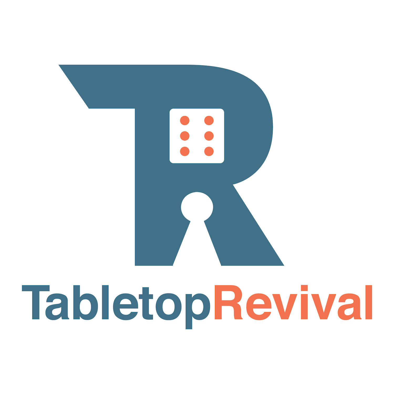
Tabletop Revival
Tabletop Revival is a small business revolving around board gaming parties and events. The business provides games, demos, and instructions for game night festivities. The logo is a combination of "T" and "R" that makes use of the negative space to portray the most recognizable gaming pieces (die and pawn). The color choices are very flexible and intended to be approachable with a hint of energy/excitement in a gender-neutral way.
Included in this project:
Logo
Sample Apparel

The Dark Knight - Lenticular Poster
This is an 11” x 17” lenticular poster, perhaps better known as “3D”. Depending on the viewing angle, the image will shift left and right giving the illusion of motion. This particular image rotates around the playing card as if a camera is shifting to show more of the Joker’s face. The effect is achieved with Photoshop layering and a series of image manipulation techniques.
This poster was stocked and sold at Walmart retail stores.
This freelance opportunity presented itself when the Lead Designer of Trends International, a major licensor of movie posters and other entertainment memorabilia, was set back on deadlines after an injury. My role with this project was production work in implementing the Lead Designer’s concept.
Kitchen & Bath Gallery
Kitchen & Bath Gallery is a family-owned kitchen & bath company serving homeowners and contractors. The branding is inspired by the imagery of blueprint floorplans. Taking the blue color of blueprint paper and adding accents of subtle technical drawings as if the lettering is being laid out on a floorplan itself. Style emphasis on the ampersand as a visual separator between "kitchen" and "bath" as well as a visual hierarchy point of focus on the variety of work they can do. The word "bath" has its counters filled in as a means of reinforcing structure and the theme of building. The word "gallery" is set with a lot of whitespace to balance out the visual treatment of the word "kitchen" and to set a tone of cleanliness and design (something their clients value)
Included in this project:
Logo
Business Card
Website
Truck Wrap

The Gamer Nerd
Founded on the premise of a love for gaming, this side project website has grown into a community of nerds. The content is based around game reviews, news, and culture.
Nerds have this tendency to take things to an obsessive level, the terms “obsessive” and “nerd” go hand and hand. The term nerd in this case is a term of endearment.
The design aesthetic is inspired by an 80s and 90s retro arcade color scheme of pink and green. The glasses are a recognized symbol of nerdiness. Extra effort was made in designing every detail of this site, including the 404 page. There has been a positive response to the uniqueness of the 404 page design from the online design community, placing this design in many “Most Creative 404 Page Designs” lists.
Further brand consistency was made through the developed social media page graphics as well.
Included in this project:
Logo
Website
Social Media Presence
Mia Roberge Music Therapy
Mia Roberge, MT-BC is a Board Certified Music Therapist. The challenge with this client was to create a branding that embodies Music Therapy as a process and as a therapeutic practice. The visuals represent the conversational nature of music, therapy, and emotions. The overlapping of imagery evokes the fluid nature of how music has an effect on the therapeutic goals of a session.
Included in this project:
Logo
Business Card
Website
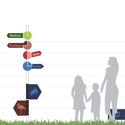
Cleveland Metroparks Zoo - Wayfinding
The Zoo uses a lot of wood carving signage to help delineate where you are. There is an opportunity to improve visibility and decrease patron frustration with the use of brighter colors. The wood grain blends into the “woodsy” backdrop of the Zoo and is easily lost in the scope of things.
Another major area of interest is time. There is nothing more frustrating than seeing a sign that says “<--- Monkeys” and after following the sign to the left for 10 minutes or more in the blazing summer sun, you still don’t see any monkeys. A time reference involved in the signage is a possible solution, such as an indicator that says, “A 10 minute walk from this point will lead you to the monkeys” or “5 minutes to the left, you will find flamingos”, etc.
The final major design element is engaging the children. Keeping in mind that kids are smaller and not always at the reading age, incorporating symbols and figures that are easily recognizable and at a child’s eye level is a fun and engaging answer to this problem.

Notable
Information retention is paramount to the education process. There isn’t a single act in academia that doesn’t require extensive information recall. Beginning with the middle school grades, teachers increasingly rely on the lecture method of instruction. Incidentally, the middle grades are a critical period in the instruction of study skills as the students in that age range are developmentally ready to become strategic learners.
Notable is a versatile tool that functions in varied note-taking environments. Considerations for different learning styles and activities that aid in information retention and recall are uniquely utilized throughout the application. This thesis offers a framework for the development of Notable.
Ethnographic research was conducted on middle school students to gain insight on their learning environments; including the classroom, lecture styles, note-taking tools, organizational methods and social interactions amongst teachers, and classmates.
Quantitative research was conducted in the form of a survey. Over 70 participants submitted answers to questions revolving around achievement levels, learning styles, tools, and study habits. Data synthesized from surveys informed the construction of user personas and usage scenarios to help focus an iterative design approach toward the development of a comprehensive note-taking application.
Included in this project:
Logo
iPad Application
User-Testing and Research